| COMP1406/1006 - Design and Implementation
of Computer Applications |
Winter 2006 |
2
Applications and LayoutManagers
|
What's in This Set
of Notes?
We look here at how to create a graphical user interface (i.e., with windows)
in JAVA. Creating GUIs in JAVA requires adding components onto
windows. We will find out how to do this as well as look at an
interesting JAVA feature called a "LayoutManager" that automatically arranges
components on the window. This allows us to create simple windows without
having to worry about resizing issues.
Here are the individual topics found in this set of notes (click on one
to go there):
| 2.1 Creating
a Basic GUI Application |
Recall that a Graphical User Interface (GUI)
is a user interface that has one or more windows.
A frame:
is the JAVA terminology for a window (i.e., its a window
frame)
represented by the Frame and JFrame classes in JAVA
used to show information and handle user interaction
has no security restrictions ... can modify files, perform I/O, open
network connections to other computers, etc..
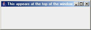
The following code creates a basic window frame in JAVA and shows it on the
screen:
javax.swing.JFrame frame = new javax.swing.JFrame("This appears at the top of the window");
frame.setSize(300, 100);
frame.setVisible(true);
Here is what it looks like:
Although this code for bringing up a new window can appear anywhere, we typically
designate a whole class to represent the window (that is, the JAVA application).
This also helps to separate the model and the user interface.
So here are the steps involved with creating your own JAVA application that
uses a main window (frame):
- Create a new class (separate from model classes) to represent your
application.
- Make this class extend JFrame (or Frame if you want to
use the older AWT classes ... more on this later).
- Create a constructor method that sets the window title (specified as
a parameter) and any other settings as well such as background color.
- Include a main() method as a starting point for the application
which is similar to the above code.
So here is the template that you should use:
import
javax.swing.*; //needed to use swing
components e.g. JFrame
public class FirstApplication
extends JFrame {
public
FirstApplication(String title) {
super(title); //
Set the title of the window
setDefaultCloseOperation(EXIT_ON_CLOSE); // allow window to close
setSize(300, 100); // Set the
size of the window
}
public static void main(String args[]) {
// Instantiate
a FirstApplication object so you can display it
FirstApplication frame = new FirstApplication("FirstApplication Example");
frame.setVisible(true);
// Show the window now
}
}
Note that we make use of the following instance method for JFrame
objects to set the size of the frame:
setSize(int frameWidth,
int frameHeight);
If we do not set the size, the window shows up so small that we only see
part of the title bar.
When frames are created, they do not appear on the screen.
They are essentially hidden. To make the window visible and give
control to your application window, we use the setVisible method:
setVisible(boolean
isVisible);
which either shows or hides the window according to the boolean value supplied.
Note that we specified for the application to EXIT_ON_CLOSE.
This is necessary since we want the application to stop running when the
window is closed. This is typical behaviour for all applications
that run under windowing operating system environments.
To test the application, just compile and run it as you normally do.
What happens ? ... A new application window should come up with the
title that we specified.
Try changing the size of the window.
What happens if we set visibility to false ? ... The application starts
but nothing is displayed. Press CNTRL + C to stop it.
What other choices do we have when the window is closed ?
We could have used:
// window is not closed
setDefaultCloseOperation(DO_NOTHING_ON_CLOSE);
// window is hidden...the
program keeps running
setDefaultCloseOperation(HIDE_ON_CLOSE);
// window is hidden and disposed
of (more later)
setDefaultCloseOperation(DISPOSE_ON_CLOSE);
It is possible to alter the look and feel of our application's windows in
JAVA. We can have our windows look like standard windows applications,
like standard cross-platform JAVA applications or any look and feel that we
would like. To do this, we merely need to add a few lines to our code
to tell the user interface manager (UIManager) that we would like all of
our windows to have a certain standard look and feel to them.
Here is what we need to add BEFORE we make our frame:
try {
UIManager.setLookAndFeel(aLookAndFeel);
} catch(Exception e) {}
JFrame.setDefaultLookAndFeelDecorated(true);
// ... now make our
frame as usual
Here,
aLookAndFeel can be any "LookAndFeel"
available in Java. Here are just some examples:
- UIManager.getCrossPlatformLookAndFeelClassName()
- UIManager.getSystemLookAndFeelClassName()
- "com.sun.java.swing.plaf.motif.MotifLookAndFeel"
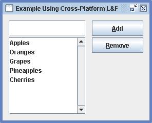
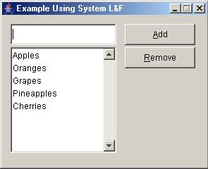
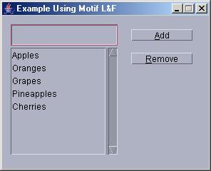
To illustrate, consider an example of a simple window (which we will show
how to construct later). We can add the following lines of code
to the main method in order to choose a particular look and feel:
import java.awt.event.*;
import javax.swing.*;
public class NoLayoutExample
extends JFrame {
public
NoLayoutExample(String name) {
// Code
for building the window ... we will see this later
}
public static void main(String[] args) {
try
{
UIManager.setLookAndFeel(UIManager.getCrossPlatformLookAndFeelClassName());
} catch(Exception e) {}
JFrame.setDefaultLookAndFeelDecorated(true);
JFrame frame = new NoLayoutExample("Example Using
Cross-Platform L&F");
frame.setVisible(true);
}
}
Here are some snapshots of the application using the cross-platform l&f,
the System (i.e., windows) l&f and the motif l&f:
If you have some spare time on your hands, you can try experimenting with
other looks and feels ... you can even create your own ;).
| 2.2 Components and Containers |
Our windows that we make will need to have various components
on them. Components are
objects on our window that have a visual representations (e.g., labels, lists,
scroll bars, buttons, text fields, menubars, menus). They may allow
the user to interact with them (e.g., lists, scroll bars, buttons, text fields,
menus).
Components may also be grouped together, much like adding elements to an
ArrayList. In fact, most components in JAVA can contain other components
as their sub-parts. This brings up the notion of a Container.
Containers:
- can contain other components (e.g., a window, JPanel, or JApplet).
- are actually components as well (e.g., we can have containers which
contain other containers)
- can have their components automatically laid out using a LayoutManager
(more on this later)
So, a container of components is conceptually "like" an ArrayList of Objects:
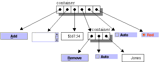
There are two main sets of visual components and containers
for user interface design in JAVA:
i) AWT (Abstract Window Toolkit)
- the original window components in JAVA
- components are contained in java.awt
package
- subclasses of java.awt.Container can contain java.awt.Components
- has component names such as Button and Label
ii) Swing
- extends the AWT by adding a set of components, the JComponents,
and a group of related support classes.
- since Containers are themselves Components, they can
be nested arbitrarily deep. This allows for arrangements such
as a frame containing two panels, each of which contains two labels etc..
- Swing takes containment one step further.
- All JComponents are subclasses of java.awt.Container.
- This allows Swing components, such as JLabel, to contain
other components (either AWT or Swing).
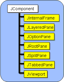
Here is just a portion of the component hierarchy. The red classes are Swing classes, while the yellow ones are AWT classes:
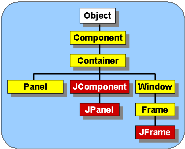
There are some interesting things to note:
- Panels are Containers (i.e. they clearly contain many
components).
- Containers are Components (i.e. recursive definition).
- All JComponents are also Containers (i.e., in Swing,
everything is a Container)
- A JFrame is a Window which is a Container.
Now, how is everything held together ?
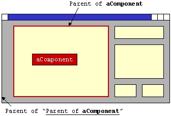
- All components keep pointers to their parent container (i.e.,
component that contains this one). Parents of nested components
are stored recursively:
Component aComponent = ... ;
Container parent = aComponent.getParent();
Container parentOfParent = parent.getParent();
- Containers keep pointers to their components (i.e., an array):
Container aParent = ... ;
Component c1 = aParent.getComponent(0);
Component c2 = aParent.getComponent(1);
Component c3 = aParent.getComponent(2);
Component[] c = aParent.getComponents(); // get them all
One of the most commonly used containers is called a Panel:

|
A Panel is:
- the simplest container class
- is itself contained (i.e., it itself is contained within a container)
- provides space in which an application can attach any other component
(including other panels)
- does not create a separate window of its own like Frame.
|
Think of a panel as a bulletin board that you can fill with components
and then you can place the bulletin board anywhere as a component itself.
All JFrames have a JPanel at the top level to which everything
is added. For simple "single-panel" windows, we can simply access this
panel by sending the getContentPane() method to our JFrame,
and then call add() to put components onto it:
JFrame frame = new JFrame("MyApplication");
frame.getContentPane().add(aComponent);
frame.getContentPane().add(anotherComponent);
frame.getContentPane().add(yetAnotherComponent);
We will see more on this in our upcoming examples.
Note that the diagram above did not expand the Component hierarchy
... there are also standard AWT components that are similar to those of the
Swing set. Now let us look at the Swing JCompoment
hierarchy in more detail. Here are some of the JComponent subclasses
for common components (shown in yellow) that are placed onto windows:
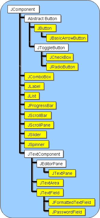
Notice that all these JComponents start with a "J".
Also notice that there are different kinds of buttons and text-based components.
In addition to these classes, there are some more advanced classes (some
of which we will look at later). Below are two more pieces of
the JComponent hierarchy (note that there was too much to show on one
picture so it has been split into multiple pictures):
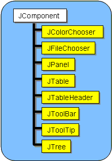
There are even more subclasses ... those dealing with menus will be shown
later.
All JComponents have the following state:
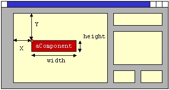
- Location, Width and Height (in pixels):
- location is an (x,y) coordinate with respect to top left corner of
parent container:
We can access/modify this information from the component at any
time:
JComponent c = ... ;
// ask a component for its location
int x = c.getX();
int y = c.getY();
// ask a component for its width or height
int w = c.getWidth();
int h = c.getHeight();
// change a component's location
c.setLocation(new
Point(100, 200));
// change a component's width and height
c.setSize(100,
50);
There is a problem with changing sizes and locations of components by default.
JAVA has "Layout Managers" that automatically compute component locations
and sizes. We can disable these layout managers or make use of
them (as we will see later). If we decide to use layout managers, we
can "suggest" sizes for our components using these (for some ints x
and y), but this does not always work :( :
c.setMaximumSize(new
Dimension(x, y));
c.setMinimumSize(new
Dimension(x, y));
c.setPreferredSize(new
Dimension(x, y));
- Vertical and Horizontal Alignment
- options are left, right, top, bottom or center (as specified by class
constants):
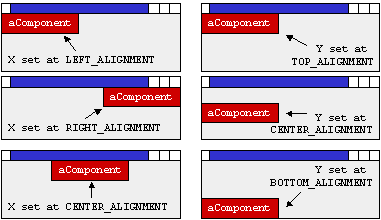
JComponent c = ... ;
// we can set a component's X alignment to
one of
// LEFT_ALIGNMENT, RIGHT_ALIGNMENT, CENTER_ALIGNMENT
c.setAlignmentX(Component.LEFT_ALIGNMENT);
// we can set a component's Y alignment to
one of
// TOP_ALIGNMENT, BOTTOM_ALIGNMENT, CENTER_ALIGNMENT
c.setAlignmentY(Component.TOP_ALIGNMENT);
As we will see, these attributes are only useful when we use layout managers.
Otherwise we can simply set the exact locations with setLocation().
- Background and Foreground
Colors:
The background is the "fill" color behind
the text, while the foreground is usually used as the text color.
JComponent c = ...
;
c.setBackground(Color.red);
c.setForeground(Color.White);
There are many colors definitions. Here are some of them:
Color.black
Color.blue
Color.cyan
Color.darkGray
Color.gray |
Color.green
Color.lightGray
Color.magenta
Color.orange |
Color.pink
Color.red
Color.white
Color.yellow |
You can also make your own Color object by specifying the amount
of red, green and blue in them as integers (between 0 and 255) or as floats
(between 0.0 and 1.0):
new Color(int r, int
g, int b);
new Color(float r, float
g, float b);
You can use the getRGB() method to return an int representing
the color of a component like this:
- Font Types and Font Sizes:
You can choose the type of font on your component
(e.g., button, text field etc.):
JComponent
c = ... ;
c.setFont(new Font("SansSerif", Font.BOLD, 12));
Here is the format for making Font objects:
new Font(String name, int
sytle, int size);
Here are some examples of typefaces (names):
"Times", "Serif",
"SansSerif", "Courier",
Here are possible Styles (notice that we can "OR" them together):
Font.BOLD, Font.ITALIC, Font.PLAIN, Font.BOLD|Font.ITALIC
The getAllFonts() method of the GraphicsEnvironment class returns
an array of all font faces available in the system.
- Ability to be Enabled/Disabled:
Sometimes we want to disable a component so
that it cannot be selected or controlled by the user. We can enable
and disable components at any time on our program.
JComponent c = ... ;
c.setEnabled(true);
...
c.setEnabled(false);
While a component is disabled, it is "greyed out", but cannot be used.
- Ability to be Hiden/Shown:
JComponent c = ... ;
c.setVisible(false);
...
c.setVisible(true);
While a component is hidden, it is invisible. By default, components
are automatically visible (not JFrames though)
In fact, there are many more attributes that we can set for components and
we will investigate some more of them throughout the course.
Using JPanels in a Basic Application
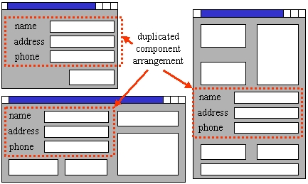
An application's window may contain many components. It is
often the case that an arrangement of components may be similar (or duplicated)
within different windows. For example, an application may require
a name, address and phone number to be entered at different times in different
windows. It is a good idea to share component layouts among the
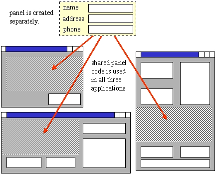
similar windows within an application.
To do this, we often lay out components onto a panel and then place the panel
on our window. We can place the created panel on many different
windows with one line of code ... this can dramatically reduce the amount
of GUI code that you have to write.
We will follow this approach. The typical steps for creating an application
are as follows:
- create a subclass of JPanel containing your application components
(i.e., add components one at a time to the panel)
- create subclass of JFrame and add your panel to it.
- test it to see if it looks the way you want it to.
Although we could have simply added our components directly to a JFrame,
this will allow us to re-use the JPanel (perhaps in some future application).
We will be seeing many examples later in which we do not make a separate JPanel.
The reason for doing the examples without a JPanel is so that the
example code is simpler to explain in the notes.
Here is an example in which we create a simple application with two classes.
The first class is a special kind of panel (we will make it a subclass of
JPanel). We will add two labels and 2 buttons to the panel.
The second class is a frame that will hold the panel and represent the main
application. Here is the panel file that specifies the objects to be
placed on the window:
import javax.swing.*;
import java.awt.*; //needed to use components
setting methods (e.g., colors, fonts)
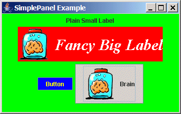
public class PanelWithFourComponents
extends JPanel {
public PanelWithFourComponents() {
// Create and
add a simple JLabel to the panel
JLabel plainLabel = new JLabel("Plain Small Label");
add(plainLabel);
// Create
a 2nd JLabel with a 32pt bold italic Serif font
// and a "brain.gif" picture to
the left of the text.
// Make the label have a red background
and white text.
JLabel fancyLabel = new JLabel("Fancy Big Label");
fancyLabel.setFont(new Font("Serif", Font.BOLD | Font.ITALIC, 32));
fancyLabel.setIcon(new ImageIcon("brain.gif"));
fancyLabel.setHorizontalAlignment(JLabel.RIGHT);
fancyLabel.setBackground(Color.red);
fancyLabel.setOpaque(true);
fancyLabel.setForeground(Color.white);
add(fancyLabel);
// Create
a JButton
JButton button1 = new JButton("Button");
button1.setBackground(Color.blue);
button1.setForeground(Color.yellow);
add(button1);
// Create
a 2nd JButton, this one with an icon
JButton button2 = new JButton("Brain", new ImageIcon("brain.gif"));
button2.setBackground(SystemColor.control);
add(button2);
// Set the background
color of the panel
setBackground(Color.green);
}
}
Notice the following:
- We added two labels ... the first was simple text ... the second had
a fancy font, coloring and an icon attached to it.
- We also added two buttons.
- ".gif" (possibly animated gifs) or ".jpg" files can be shown in the
application by using the ImageIcon class.
- Different fonts can be used on labels, we can even bold them,
make them italics, and change their
size.
- Both buttons and labels can have an associated icon which can be aligned
left/right of the text.
- SystemColor.control lets us specify the standard
operating system control color (in windows, it is gray).
- Objects are merely added one-by-one to the panel ... we will explain
later how they are arranged.
Here is the main application file:
import
javax.swing.*;
public class SimplePanelTestFrame
extends JFrame {
public SimplePanelTestFrame(String title) {
super(title); // Must be first line
add(new PanelWithFourComponents());
setDefaultCloseOperation(EXIT_ON_CLOSE);
setSize(650, 200);
}
public static void main(String args[]) {
JFrame frame = new SimplePanelTestFrame("SimplePanel Example");
frame.setVisible(true);
}
}
Note the following:
- We added the panel that we created earlier to the frame.
- The frame of the window also has its own background color, but this
is hidden by the green panel which is on top of it.
We will have to make sure that the brain.gif
file is in the directory from where our code is running.
As we all know ... JAVA was developed for the internet and
JAVA applications were meant to be run within an internet browser. Since
browsers are often resized, the application's components need to be rearranged
so that they ALL fit on the browser window at all times. In fact, JAVA
provides a mechanism called a Layout Manager that allows the
automatic arrangement (i.e., layout) of the components of an application.
- A LayoutManager is an interface
(java.awt.LayoutManager)
- It defines methods necessary for a class to be able to arrange Components
within a Container
- There are 8 useful layout classes that implement LayoutManager:
- FlowLayout
- BorderLayout
- CardLayout
- GridLayout
- GridBagLayout
- BoxLayout
- OverlayLayout
(not described in these notes)
- SpringLayout
(not described in these notes)
Layouts are set for a panel using the setLayout()
method. If set to null, then no layout manager
is used.
So why should we use a LayoutManager ?
- we would not have to compute locations and sizes for our components
- our components will resize automatically when the window is resized
- our interface will appear "nicely" on all platforms
Before we look at some of these layout managers, we will first see how to
lay components out without using them.
2.4.1 Null Layout
We can actually set the layout for our window panel to be null so
that we have full control on the exact locations of all objects.
This means that we are NOT using a layout manager. So, we must
arrange the components on our own.
The advantages of not having any layout manager
are:
- You can specify exactly where you want to place
the components.
- Much simpler than some of the layout managers
such as GridBagLayout
The disadvantages are:
- You do not get to specify any resizing behaviour,
so your window does not resize properly !!
- Usually, your component locations rely on other
component locations, so moving a single component may cause you to want to
move other components around again.
- You MUST pre-plan your entire window (this is
actually be a good thing to do anyway) by specifying the exact locations of
components and figure out the spacing between the components that you would
like to use.
To choose to use no layout manager, we just send the following message to
a panel:
We must then specifically place all of our components by using the following:
//set the location of the component
within its container
void setLocation(int x,
int y);
//set the dimensions of the component
void setSize(int width,
int height);
Things to note:
- The locations and sizes are in pixels.
- Locations are always with respect to the top left corner of the container
which is location (0,0).
- Also, the top left corner of the component will appear at the specified
location.
Components are added to containers by using the add() method
as before:
anyContainer.add(aComponent);
Example
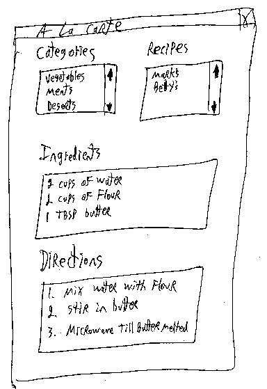
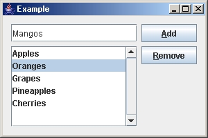
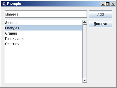
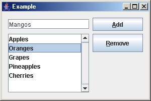
Here is an example showing how to build a simple window with a text field,
a list, and two buttons. First, we need to sketch out the window on
paper:
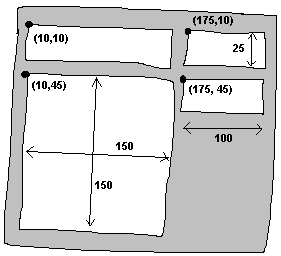
Here is the code:
import javax.swing.*;
public class NoLayoutExample extends JFrame {
public NoLayoutExample(String
name) {
super(name);
// Choose to lay out components manually
setLayout(null);
//The text field
JTextField newItemField = new JTextField();
newItemField.setLocation(10,10);
newItemField.setSize(150,25);
add(newItemField);
//The Add button
JButton addButton = new JButton("Add");
addButton.setMnemonic('A');
addButton.setLocation(175, 10);
addButton.setSize(100,25);
add(addButton);
//The List
String[] stuff = {"Apples", "Oranges", "Grapes", "Pineapples", "Cherries"};
JList itemsList = new JList(stuff);
JScrollPane scrollPane = new JScrollPane(itemsList,
ScrollPaneConstants.VERTICAL_SCROLLBAR_ALWAYS,
ScrollPaneConstants.HORIZONTAL_SCROLLBAR_AS_NEEDED);
scrollPane.setLocation(10,45);
scrollPane.setSize(150,150);
add(scrollPane);
//The Remove button
JButton removeButton = new JButton("Remove");
removeButton.setMnemonic('R');
removeButton.setLocation(175,45);
removeButton.setSize(100,25);
add(removeButton);
setDefaultCloseOperation(EXIT_ON_CLOSE);
setSize(290, 230); // manually computed sizes
setResizable(false);
}
public static void
main(String[] args) {
try
{
UIManager.setLookAndFeel(UIManager.getSystemLookAndFeelClassName());
} catch(Exception e) {}
JFrame.setDefaultLookAndFeelDecorated(true);
JFrame frame = new NoLayoutExample("Without a Layout Manager");
frame.setVisible(true);
}
}
Note the following:
- The mnemonic for a button allows you to press ALT
along with the character to select the button. It acts as if you clicked
the button.
- You can put something in a JTextField using one of the following:
- newItemField = new JTextField("some
text");
- newItemField.setText("any text at all");
- You can put something in a JList using the following:
- String[] stuff = {"Apples", "Oranges", "Grapes",
"Plums"};
itemsList = new JList(stuff);
- JLists are usually placed within a JScrollPane so that you can have scroll
bars automatically on them.
- We set the window to be non-resizable. Since our components will
not move or grow anyway, there is no use in allowing a larger window.
Here is what the window looks like when running our code:
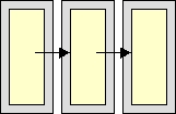
2.4.2 FlowLayout
|
- components are arranged horizontally from left to right, like
lines of words in a paragraph.
- if no space left on current "line", components flow to next line
- components are centered horizontally on each line by default
- often used to arrange buttons in a panel
|
There are three constructors:
public FlowLayout();
public FlowLayout(int align);
public FlowLayout (int align, int hGap, int
vGap);
- align may be any one of three class constants: LEFT,
RIGHT, CENTER
- specifies how components are justified
- hGap and vGap specify the horizontal and vertical pixels
between components
Example
Here is a simple example that adds 5 buttons (two with icons) to a panel
which uses a FlowLayout.
import
java.awt.*;
import javax.swing.*;
public class
FlowLayoutManagerExample
extends JFrame {
public
FlowLayoutManagerExample (String title)
{
super(title);
setLayout(new
FlowLayout(FlowLayout.CENTER, 5, 5));
add(new JButton("one"));
add(new JButton("two"));
add(new JButton("three"));
add(new JButton("four", new ImageIcon("brain.gif")));
add(new JButton(new
ImageIcon("brain.gif")));
setDefaultCloseOperation(EXIT_ON_CLOSE);
setSize(500, 200);
}
public static void
main(String args[]) {
FlowLayoutManagerExample frame = new FlowLayoutManagerExample("Flow Layout Example");
frame.setVisible(true);
}
}
Here is the result obtained when the application is run:
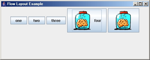
Notice
- we are using the default cross-platform look and feel, which makes
the buttons look "metallic".
- FlowLayout (and all the other
layout managers) are in the java.awt
package, so we imported java.awt.*
- the components are merely added left to right until no more room is
available.
- the components are centered on the window; although we could have instead
used FlowLayout.LEFT or FlowLayout.RIGHT in the constructor to
have the left or right aligned, respectively.
- There is a 5 pixel gap between the components, which we could have
made larger or smaller in the constructor.
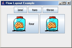
Try resizing the window to 300x200. The components will be rearranged
accordingly:
2.4.3 BorderLayout
|
- This is the default layout for a JFrame
- Divides the container into regions: north, south, east, west
and center.
- Regions are specified using class constants (BorderLayout.NORTH,
BorderLayout.SOUTH, etc....)
- A single component (which may itself be a container) fills each
region
|
There are two useful constructors:
public BorderLayout()
public BorderLayout(int hgap, int vgap);
//allows spacing between components
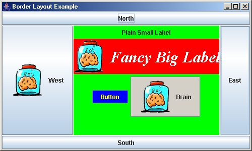
Example
In this example, we add 4 buttons along the north,
south, east and west of the window. We also make use of our previous
code which created a panel with 2 labels and 2 buttons and add this to the
center of the pane, just for fun.
import java.awt.*;
import javax.swing.*;
public class BorderLayoutManagerExample extends JFrame
{
public BorderLayoutManagerExample (String title) {
super(title);
// the JFrame already has a
border layout by default, but
// by doing this, we also get to
specify a 2 pixel gap (i.e.,
// margin) between components.
setLayout(new BorderLayout(2,2));
add(BorderLayout.NORTH, new JButton("North"));
add(BorderLayout.SOUTH, new JButton("South"));
add(BorderLayout.EAST, new JButton("East"));
add(BorderLayout.WEST, new JButton("West", new ImageIcon("brain.gif")));
add(BorderLayout.CENTER, new PanelWithFourComponents());
setDefaultCloseOperation(EXIT_ON_CLOSE);
setSize(500, 300);
}
public static void main(String args[]) {
BorderLayoutManagerExample frame = new BorderLayoutManagerExample("Border Layout Example");
frame.setVisible(true);
}
}
Here is the result:
Note that you do NOT have to put something in all
of the border locations. You may simply want to just use the top/bottom
or perhaps left/right/bottom. A common situation is to have a panel
of components along the bottom or side of a window.
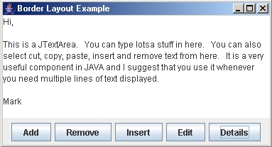
For example, by using this code (which makes a panel
of buttons on the bottom of the window):
JPanel buttonPanel = new JPanel();
buttonPanel.add(new JButton("Add"));
buttonPanel.add(new JButton("Remove"));
buttonPanel.add(new JButton("Insert"));
buttonPanel.add(new JButton("Edit"));
buttonPanel.add(new JButton("Details"));
add(BorderLayout.SOUTH, buttonPanel);
add(BorderLayout.CENTER, new JTextArea());
we obtain this window:
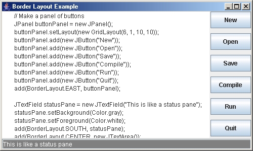
Or, perhaps we would like to place some buttons on the right side of the
window and maybe a status pane or progress bar on the bottom.
The following code does this (while making use of a GridLayout ... which
we will talk about soon):
JPanel buttonPanel = new JPanel();
buttonPanel.setLayout(new GridLayout(6,1,10,10));
buttonPanel.add(new JButton("New"));
buttonPanel.add(new JButton("Open"));
buttonPanel.add(new JButton("Save"));
buttonPanel.add(new JButton("Compile"));
buttonPanel.add(new JButton("Run"));
buttonPanel.add(new JButton("Quit"));
add(BorderLayout.EAST, buttonPanel);
JTextField statusPane = new JTextField("This is like a status pane");
statusPane.setBackground(Color.gray);
statusPane.setForeground(Color.white);
add(BorderLayout.SOUTH, statusPane);
add(BorderLayout.CENTER, new JTextArea());
produces this window:
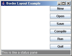
As you can see below, the window still resizes nicely automatically:
2.4.4 CardLayout
|
- Layout manager for a container....each component is treated as
a "card"
- Displays components one a time, only one is visible at a time
- Often used for swapping panels of components in and out
- Used for managing a set of panels that present themselves as
a stack of tabbed folders
- User can interact with cards like a slide show
|
There are two constructors:
public CardLayout()
public CardLayout(int hgap, int vgap)
Stacking methods include the following:
public void first(Container owner)
public void next(Container owner)
public void previous(Container owner)
public void last(Container owner)
public void show(Container owner, String name)
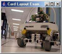
Example
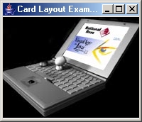
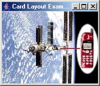
This example creates a window with three cards which are displayed using
a CardLayout manager. Since only one card can be shown
at a time, only one image appears on the window. We can select
the image by using the show() method for the card layout manager to
specify which one to show. Later in the notes, we will see how
to hook up some buttons to get the cards showing as a slide show when buttons
are pressed.
import java.awt.*;
import javax.swing.*;
public class CardLayoutManagerExample extends JFrame
{
private CardLayout cardLayoutManager;
public CardLayoutManagerExample(String title) {
super(title);
CardLayout layoutManager = new CardLayout(0,0);
setLayout(layoutManager);
// Add (and give names to) components using the layout manager
JLabel first = new JLabel(new ImageIcon("trilobot.jpg"));
JLabel second = new JLabel(new
ImageIcon("laptop.jpg"));
JLabel third = new JLabel(new
ImageIcon("satelite.jpg"));
add("first", first);
add("second", second);
add("third", third);
// Pick the component to show, in this case, the first
layoutManager.show(getContentPane(),
"first");
setDefaultCloseOperation(EXIT_ON_CLOSE);
setSize(200,172);
}
public static void main(String args[]) {
CardLayoutManagerExample frame = new
CardLayoutManagerExample("Card Layout Example");
frame.setVisible(true);
}
}
Notice that the show() method requires us to pass in something called
the "contentPane". This is actually the "hidden" JPanel of the
JFrame on which everything is placed. Here is what the
window looks like when run:
If we were to have changed the 2nd parameter in the show() method to "second" or "third",
we would get the other images showing instead:
Note that we are simply showing cards that have a single JLabel on them (which has a picture on
it). However, remember that you can actually place any JComponent or Container (e.g., JPanel) on the card. So, for
example, we could have added our PanelWithFourComponents
as a single card.
2.4.5 GridLayout
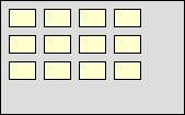
|
- Lays out its components into a rectangular grid
- Often used for calendar or spreadsheet type user interfaces
- Components must be added row by row, left to right
|
There are two constructors:
public GridLayout(int rows, int columns)
public GridLayout(int rows, int columns, int
hGap, int vGap)
throws IllegalArgumentException;
Example
We have already seen in our BorderLayout manager example that we can create
a simple grid of buttons. There we created a 6 row, 1 column panel
of buttons which were all equally sized:
JPanel buttonPanel
= new JPanel();
buttonPanel.setLayout(new GridLayout(6,1,10,10));
buttonPanel.add(new JButton("New"));
buttonPanel.add(new JButton("Open"));
buttonPanel.add(new JButton("Save"));
buttonPanel.add(new JButton("Compile"));
buttonPanel.add(new JButton("Run"));
buttonPanel.add(new JButton("Quit"));
Now let us create a window with a 6x8 grid of components on them.
For simplicity, we will use all JButtons and randomly set their colors to
white or black. We can easily modify the code to have images
on the buttons or text, or even to replace the buttons with arbitrary components
or panels.
import java.awt.*;
import javax.swing.*;
public class GridLayoutManagerExample extends JFrame {
public GridLayoutManagerExample(String
title) {
super(title);
setLayout(new GridLayout(6,8,5,5));
for
(int row=1; row<=6; row++)
for (int
col=1; col<=8; col++) {
JButton b = new JButton();
if (Math.random() < 0.5)
b.setBackground(Color.black);
else
b.setBackground(Color.white);
add(b);
}
setDefaultCloseOperation(EXIT_ON_CLOSE);
setSize(250, 200);
}
public static void main(String
args[]) {
GridLayoutManagerExample frame = new GridLayoutManagerExample("Grid Layout Example");
frame.setVisible(true);
}
}
Here is the result:
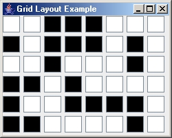
Notice that the buttons are all evenly sized and evenly spaced. There
is some extra margin along the right and bottom as leftover space that cannot
be evenly distributed among the buttons. This example shows the
entire window using the GridLayout,
but remember that any JPanel can
use this layout so this grid can be applied to a panel that is only one of
many components in a window.
2.4.6 GridBagLayout
|
- For complicated layout needs (typically very useful ... since
we have full control).
- Also arranges components in a grid, but the exact grid size is
not explicitly defined.
- Rows and columns of grid may have different sizes (see image
below)
- Components can occupy (i.e., span across) multiple rows
and columns (see image below)
- For each component, there is an elaborate set of constraints
for determining how much space is used by the component
|
We will create GridBagConstraint objects.
- They are used to package together a set of constraints for a particular
component.
- Once the constraints are chosen, they must be set using the setConstraints()
method for the component.
- Each constraint has a default which is automatically used if the constraint
is not specified.
Here is an example of a window showing the breakdown of the components onto
a grid:
We will now take a look at the many constraints which we can use for each
component:
Specifies the grid cell (column=x and row=y) that the upper
left of the component will be displayed in, where the upper-left-most grid
cell has address gridx = 0, gridy = 0.
- Use GridBagConstraints.RELATIVE
(the default value) to specify that the component should be placed just to
the right of (for gridx) or just below of (for gridy) the component
that was added to the container just before this component was added.
Specifies the number of columns (gridwidth) and rows (gridheight)
that the component will occupy. The default value is 1.
- Use GridBagConstraints.REMAINDER
to specify that the component be the last one in its row (for gridwidth)
or column (for gridheight).
Used in resizing when the component's display area is larger than the component's
requested size to determine how to resize the component. Possible values are:
- GridBagConstraints.NONE (the
default - the component will not grow in either direction)
- GridBagConstraints.HORIZONTAL
(make the component wide enough to fill its display area horizontally, but
don't change its height),
- GridBagConstraints.VERTICAL
(make the component tall enough to fill its display area vertically, but
don't change its width), and
- GridBagConstraints.BOTH
(make the component fill its display area entirely).
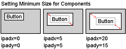
Specifies the component's internal padding (spacing around the component)
within the layout, how much to add to the minimum size of the component.
Since the GridBagLayout manager lays out the components such that the grid
sizes are not specified explicitly, each component is given a minimum size.
Sometimes, we would like a component to have a larger minimum size.
Using these constraints we can set the width of the component to be at least
its minimum width plus (ipadx * 2) pixels (since the padding applies
to both sides of the component). Similarly, the height of the
component will be at least the minimum height plus (ipady * 2) pixels.
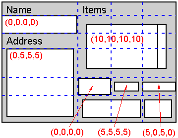
Specifies the component's external padding, the minimum amount of space between
the component and the edges of its display area. To do this, we make
an instance of the Insets class (e.g. new Insets(10, 10, 10, 10)).
The order of the parameters for this constructor is top, left, bottom then
right.
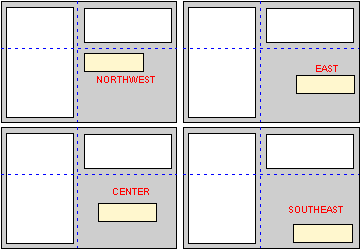
Used when the component is smaller than its display area to determine where
(within the display area) to place the component. Also, when resizing,
this allows the component to be fixed at a corner or edge. Valid values
are:
- GridBagConstraints.CENTER
(the default),
- GridBagConstraints.NORTH,
- GridBagConstraints.NORTHEAST,
- GridBagConstraints.EAST,
- GridBagConstraints.SOUTHEAST,
- GridBagConstraints.SOUTH,
- GridBagConstraints.SOUTHWEST,
- GridBagConstraints.WEST,
and
- GridBagConstraints.NORTHWEST
Used to determine how to distribute space when resizing the window. A zero
value indicates the component does not grow horizontally/vertically on its
own. Components with larger weight values will occupy more of the additional
space than components with small weight values. Unless you specify
a weight for at least one component in a row (weightx) and column
(weighty), all the components clump together in the center of their
container. This is because when the weight is zero (the default), the GridBagLayout
object puts any extra space between its grid of cells and the edges of the
container.
In order to fully understand the effects of these constraints, you should
create an example piece of code and try changing the values. Resize
the window to see the effects of your changes. Experience is best to
help you understand.
Example
This example represents a kind of "recipe" that you can follow when using
the GridBagLayout managers. The example is taken from Core Java
2 volume 1-Fundamentals, by C.S. Horstmann and G. Cornell, Sun Microsystems,
1999.
Step 1:
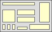
Sketch out the component layout on a piece of paper
(i.e., the way you want the window to look). Note that it will
not ALWAYS look the EXACT way that you want it to when its done, but you can
get a rough idea as to the layout:
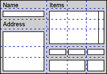
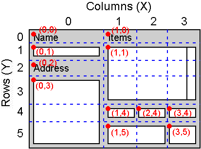
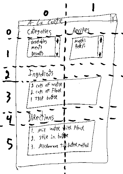
Step 2/3:
Identify the different components (i.e., labels, text
fields, lists etc...) and add grid lines to your drawing such that the small
components are each contained in a cell and the larger components span multiple
cells. Label the rows and columns of your grid with 0,1,2,3, ... You
can now read off the gridx, gridy, gridwidth,
and gridheight values.
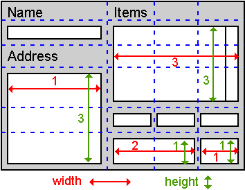
Step 4:
Now worry about the resizing issues. For
each component, ask yourself whether it needs to fill its cell horizontally
or vertically. If not, how do you want it aligned ? This tells
you the fill and anchor parameters.
Step 5:
Set all weights to 100. However, if you want a particular
row or column to always stay at its default size, set the weightx
or weighty to 0 in all components that belong to that row
or column. MAKE SURE that
at least one component in each row and column has a non-zero weight!!
Step 6:
Write the code. Carefully double-check your settings
for the GridBagConstraints. One wrong constraint can ruin your whole
layout and waste you hours of time :(. Also, it is often the
case that some components act strangely when the window is resized.
It sometimes seems as though your weight settings are being ignored.
This is often due to the way that the GridBagLayout
manager tries to determine starting (or preferred) sizes for the components.
So, it is sometimes necessary to specify that your objects are to be treated
equally in this regard. You can do this by setting the preferred size
of your growable components to some similar value. For example: scrollPane.setPreferredSize(new Dimension(10,10)); It is likely that you may have to play a little
with the insets and margins of your components to get them to the size that
you want.
Step 7:
Compile, run, and enjoy. Note that your
gridlines may not always be exactly where you wanted them and that your components
may not be the size that you want. You may have to play around
by adding additional grid lines and specifying that a component spans multiple
grid cells.
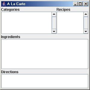
Here is an example of a recipe browser build using
the above steps. Look at the code and pay particular attention to the
gridx, gridy, gridwidth, and
gridheight values. Notice there is a lot of repeated
code that can be shortened if, for example, all the JLabels are laid
out together and their constraint settings reused.
import
java.util.*;
import java.awt.*;
import javax.swing.*;
public class RecipeBrowser extends JFrame {
public RecipeBrowser(String
name) {
super(name);
GridBagLayout layout
= new GridBagLayout();
GridBagConstraints
constraints = new GridBagConstraints();
setLayout(layout);
JLabel label = new JLabel("Categories");
constraints.gridx
= 0;
constraints.gridy
= 0;
constraints.gridwidth
= 1;
constraints.gridheight
= 1;
constraints.weightx
= 0; // don't grow horizontally
constraints.weighty
= 0; // don't grow vertically
constraints.anchor
= GridBagConstraints.WEST;
layout.setConstraints(label,
constraints);
add(label);
label = new JLabel("Recipes");
constraints.gridx
= 1;
constraints.gridy
= 0;
constraints.gridwidth
= 1;
constraints.gridheight
= 1;
constraints.weightx
= 0; // don't grow horizontally
constraints.weighty
= 0; // don't grow vertically
layout.setConstraints(label,
constraints);
constraints.anchor
= GridBagConstraints.WEST;
add(label);
JList categories =
new JList();
categories.setPrototypeCellValue("xxxxxxxxxxx");
JScrollPane scrollPane
= new JScrollPane(categories,
ScrollPaneConstants.VERTICAL_SCROLLBAR_ALWAYS,
ScrollPaneConstants.HORIZONTAL_SCROLLBAR_AS_NEEDED);
constraints.gridx
= 0;
constraints.gridy
= 1;
constraints.gridwidth
= 1;
constraints.gridheight
= 1;
constraints.fill =
GridBagConstraints.BOTH;
constraints.weightx
= 1;
constraints.weighty
= 1;
layout.setConstraints(scrollPane,
constraints);
add(scrollPane);
JList recipes = new JList();
recipes.setPrototypeCellValue("xxxxxxxxxxxxxxxxxxxxxxxxxxxxxxxxxxx");
scrollPane = new JScrollPane(recipes,
ScrollPaneConstants.VERTICAL_SCROLLBAR_ALWAYS,
ScrollPaneConstants.HORIZONTAL_SCROLLBAR_AS_NEEDED);
constraints.gridx
= 1;
constraints.gridy
= 1;
constraints.gridwidth
= 1;
constraints.gridheight
= 1;
constraints.fill =
GridBagConstraints.BOTH;
constraints.weightx
= 1;
constraints.weighty
= 1;
layout.setConstraints(scrollPane,
constraints);
add(scrollPane);
label = new JLabel("Ingredients");
constraints.gridx
= 0;
constraints.gridy
= 2;
constraints.gridwidth
= 1;
constraints.gridheight
= 1;
constraints.weightx
= 0; // don't grow horizontally
constraints.weighty
= 0; // don't grow vertically
layout.setConstraints(label,
constraints);
add(label);
JTextArea ingredients
= new JTextArea();
scrollPane = new JScrollPane(ingredients,
ScrollPaneConstants.VERTICAL_SCROLLBAR_AS_NEEDED,
ScrollPaneConstants.HORIZONTAL_SCROLLBAR_AS_NEEDED);
constraints.gridx
= 0;
constraints.gridy
= 3;
constraints.gridwidth
= 2;
constraints.gridheight
= 1;
constraints.fill =
GridBagConstraints.BOTH;
constraints.weightx
= 1;
constraints.weighty
= 1;
layout.setConstraints(scrollPane,
constraints);
add(scrollPane);
label = new JLabel("Directions");
constraints.gridx
= 0;
constraints.gridy
= 4;
constraints.gridwidth
= 1;
constraints.gridheight
= 1;
constraints.weightx
= 0; // don't grow horizontally
constraints.weighty
= 0; // don't grow vertically
layout.setConstraints(label,
constraints);
add(label);
JTextArea directions
= new JTextArea();
scrollPane = new JScrollPane(directions,
ScrollPaneConstants.VERTICAL_SCROLLBAR_AS_NEEDED,
ScrollPaneConstants.HORIZONTAL_SCROLLBAR_AS_NEEDED);
constraints.gridx
= 0;
constraints.gridy
= 5;
constraints.gridwidth
= 2;
constraints.gridheight
= 1;
constraints.fill =
GridBagConstraints.BOTH;
constraints.weightx
= 1;
constraints.weighty
= 1;
layout.setConstraints(scrollPane,
constraints);
add(scrollPane);
setDefaultCloseOperation(EXIT_ON_CLOSE);
setSize(300,300);
}
public static
void main(String[] args) {
JFrame frame = new RecipeBrowser("A La Carte");
frame.setVisible(true);
}
}
Here are some interesting tips/points about
the code above:
- If you do not want the component to resize when the window is resized
(such as the "Categories" and "Recipes" labels), then you can:
- set the weightx and weighty to zero.
- you may still need to specify the fill to BOTH if you want to have this
component take up its entire cell space...in case some other cell in the
same row/column has caused this cell to enlarge.
- you should anchor the labels (in this case to the left (i.e., WEST)
of its grid cell).
- If you are setting the fill to
BOTH for your component, then
you do not need to set the anchor.
- The setPrototypeCellValue() method is
used to specify a "typical" String that would appear in the JList. JAVA will use this
string (along with the Font that is set for the list) to figure out how many
pixels wide it should make the list.
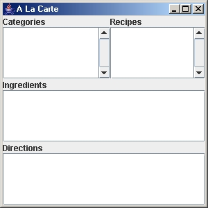
Here is the result:
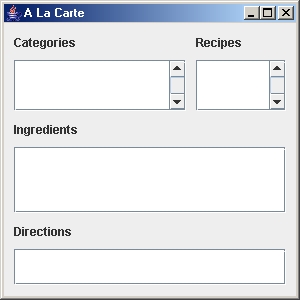
Note that we can adjust how much "space" each component takes according to
the weightx and weighty settings. For example, currently we have
these settings:
COMPONENT
|
weightx
|
weighty
|
category list
|
1
|
1
|
recipe list
|
1
|
1
|
ingredients text area
|
1
|
1
|
directions text area
|
1
|
1
|
We can change these weights to allow the categories list to be wider than
the recipe list and the Ingredients area to be larger (in the y) than the
lists and the directions area to be smaller (in the y) than the lists as
follows:
COMPONENT
|
weightx
|
weighty
|
category list
|
2
|
2
|
recipe list
|
1
|
2
|
ingredients text area
|
1
|
3
|
directions text area
|
1
|
1
|
We would then get the following look:
So, by playing with the weights, you can usually achieve
the desired look, after some trial and error.
Note that we can also make some nice margins around the window and components.
We can set the insets for each component by using:
constraints.insets(new Insets(top, left, bottom, right));
where top, left, bottom and right are set as follows
for our components:
COMPONENT
|
top
|
left
|
bottom
|
right
|
categories label
|
10
|
10
|
0
|
0
|
recipes label
|
10 |
10 |
0
|
0
|
categories list
|
10 |
10 |
0
|
0
|
recipes list
|
10 |
10 |
0
|
10
|
ingredients label
|
10 |
10 |
0
|
0
|
ingredients text area
|
10 |
10 |
0
|
10
|
directions label
|
10 |
10 |
0
|
0
|
directions text area
|
10 |
10 |
10
|
10
|
We obtain this nice look:
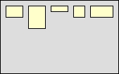
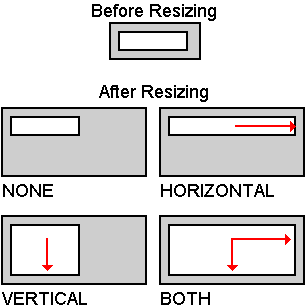
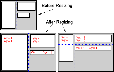
Try making the following window ... shown before and after resizing:
For each component, we need to determine how it grows:
- the text field seems to grow only horizontally
- the buttons don't seem to grow
- the buttons and text field have the same height
- the list seems to grow in both directions
- there are margins around the window
Here is the code:
import java.awt.*;
import
javax.swing.*;
public
class GridBagLayoutManagerExample
extends JFrame {
public GridBagLayoutManagerExample(String
name) {
super(name);
GridBagLayout layout = new GridBagLayout();
GridBagConstraints constraints = new GridBagConstraints();
setLayout(layout);
JTextField newItemField = new JTextField();
constraints.gridx = 0;
constraints.gridy = 0;
constraints.gridwidth = 1;
constraints.gridheight = 1;
constraints.fill = GridBagConstraints.BOTH;
constraints.insets = new Insets(12,
12, 3, 3);
constraints.weightx = 10;
constraints.weighty = 0;
layout.setConstraints(newItemField, constraints);
add(newItemField);
JButton addButton = new JButton("Add");
addButton.setMnemonic('A');
constraints.gridx = 1;
constraints.gridy = 0;
constraints.gridwidth = 1;
constraints.gridheight
= 1;
constraints.fill = GridBagConstraints.HORIZONTAL;
constraints.insets = new Insets(12,
3, 3, 12);
constraints.anchor = GridBagConstraints.NORTHWEST;
constraints.weightx = 0;
constraints.weighty = 0;
layout.setConstraints(addButton, constraints);
add(addButton);
String[] stuff = {"Apples", "Oranges", "Grapes", "Pineapples", "Cherries"};
JList itemsList = new JList(stuff);
JScrollPane scrollPane = new JScrollPane(itemsList,
ScrollPaneConstants.VERTICAL_SCROLLBAR_ALWAYS,
ScrollPaneConstants.HORIZONTAL_SCROLLBAR_AS_NEEDED);
constraints.gridx = 0;
constraints.gridy = 1;
constraints.gridwidth = 1;
constraints.gridheight = 1;
constraints.fill = GridBagConstraints.BOTH;
constraints.insets = new Insets(3,
12, 12, 3);
constraints.anchor = GridBagConstraints.CENTER;
constraints.weightx = 10;
constraints.weighty = 1;
layout.setConstraints(scrollPane, constraints);
add(scrollPane);
JButton removeButton = new JButton("Remove");
removeButton.setMnemonic('R');
constraints.gridx = 1;
constraints.gridy = 1;
constraints.gridwidth = 1;
constraints.gridheight
= 1;
constraints.fill = GridBagConstraints.HORIZONTAL;
constraints.insets = new Insets(3,
3, 0, 12);
constraints.anchor = GridBagConstraints.NORTH;
constraints.weightx = 0;
constraints.weighty = 0;
layout.setConstraints(removeButton, constraints);
add(removeButton);
setDefaultCloseOperation(EXIT_ON_CLOSE);
setSize(400,300);
}
public static void main(String[] args)
{
JFrame frame = new GridBagLayoutManagerExample("Example");
frame.setVisible(true);
}
}
It is interesting to see how other components in the
same row and column actually affect the other components. For
example, assume that the textField had a fill set to HORIZONTAL instead of
BOTH. Its height would then be different since it would take
up only the height that is needed for the component by default instead of
taking up the height of the grid cell that it lies in ... which depends on
the height of the add button. Also, for example, the width of
the Add button depends on the width of the Remove button since it has a fill
HORIZONTAL which takes up the width of the whole cell ... which depends on
the width of the Remove button.
To see this, we will set the fill to HORIZONTAL for the text field and set
the internal padding of the Remove button to ipadx = 20; ipady = 10.
Here is the result as expected:
|
|
|
Before changes
|
After changes
|
So you can see ... things can get quite complicated. Make sure
to practice a lot with this particular layout manager.
2.4.7 BoxLayout
|
- components are arranged horizontally from left to right, or vertically
from top to bottom.
- much like flow layout, except there is no wraparound when space
runs out.
- often used to arrange components in a panel
|
Here is the one constructor:
public BoxLayout(Container panel, int axis);
- axis may be BoxLayout.X_AXIS or BoxLayout.Y_AXIS
only.
Example
Here is a simple example that adds some components to a panel which uses
a BoxLayout.
import java.awt.*;
import javax.swing.*;
public class BoxLayoutManagerExample extends JFrame {
public BoxLayoutManagerExample (String
title) {
super(title);
setLayout(new BoxLayout(this.getContentPane(), BoxLayout.Y_AXIS));
add(new JButton("one"));
add(new JButton("two"));
add(new JButton("three"));
add(new JButton("four", new ImageIcon("brain.gif")));
add(new JButton(new ImageIcon("brain.gif")));
setDefaultCloseOperation(EXIT_ON_CLOSE);
setSize(200, 300);
}
public static void main(String args[])
{
BoxLayoutManagerExample frame = new
BoxLayoutManagerExample("Box Layout
Example");
frame.setVisible(true);
}
}
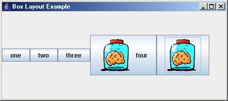
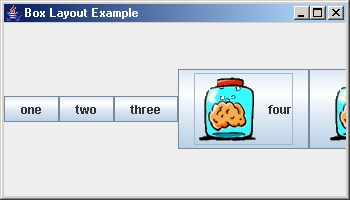
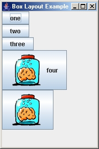
Here are three screen snapshots. The first two show the results
of the above code which "lines up" the components along the X_AXIS.
Notice how the components DO NOT wrap around to the next line when the window
is shrunk. The last snapshot shows the arrangement that would
be obtained if the Y_AXIS was used.